When I’m consulting with businesses about the “look” of their corporate communications, one of the hot questions is always, “Which font should we use?” In an earlier Creative Tips post I touched on this subject as far as saying “At least don’t use the defaults” without going into much detail as to how you would decide on one.
Most companies, except for some very large ones, prefer to stick with the fonts that come with their computer, or with their Office software suite, whether it’s Microsoft Office, Google Docs, Libre Office or something else. But, even so, click on that Font drop-down arrow and the list goes on and on. Does it matter which one you use? How would you know? And what about headings – should they use a different typeface, or a larger version of the same one used for text?
Readability vs. Legibility
At first glance, these terms are synonymous, but to a designer or typographer they are not. Readability refers to how comfortable a particular typeface is to read in long passages of text, such as letters, articles or books. Legibility refers to the ease with which the text can be understood in a quick look. Text can be legible without being very readable.
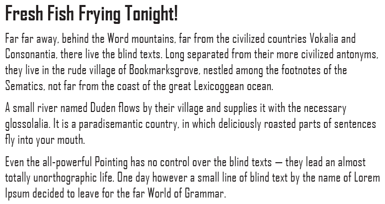
To show you what I mean, here’s an example: Agency FB is a font installed with Microsoft Office. It makes an effective headline, but would you really want to read several paragraphs of it, never mind several pages?
I didn’t think so.
The rule, then, is use legible fonts for headlines, and readable fonts for text.
What makes a font readable?
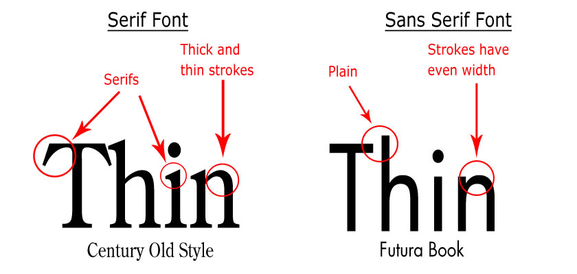
Fonts come in two flavors. Serif fonts have strokes (the lines that make up the letter forms) that vary a bit in thickness, and have little decorations called serifs at the ends of the strokes. Sans Serif (“Sans” means “without”) fonts do not have serifs, and the strokes are more uniform in thickness.
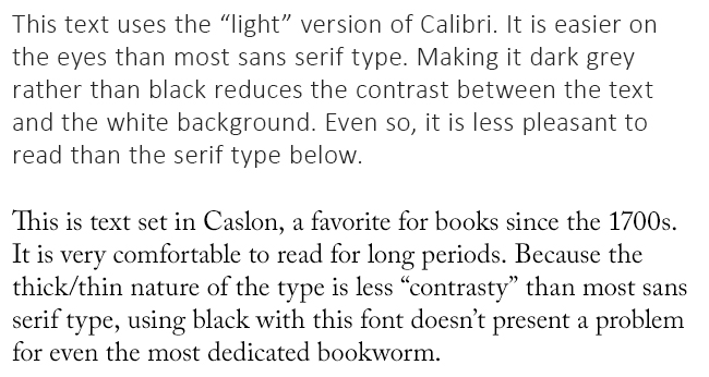
The studies that have been done on this show that when it comes to printed material, such as a book, serif fonts tend to be more readable than sans serif. Nobody has a definite explanation for this, but the studies show that for long passages of text, all else being equal, sans serifs are less comfortable to read.
Part of this is “glare,” the uncomfortable feeling you get when your eyes have to look at deep black against stark white. Office furniture makers mostly avoid black desktops for the same reason: white paper against a black background is hard on the eyes. Sans serif fonts, with their overall thicker strokes, present more contrast that serif fonts. When designers use sans serif type for anything other than headlines, they tend to use very lightweight fonts or use a lighter color ink than black, or both.
It may also be that we are more used to serif type; almost all books have been printed with serif typefaces since type was invented. Even the ancient Romans put serifs on the lettering they carved into monuments.
How to Pick a Font
It may seem like an odd thing for a designer to say, but when you select a font for your resume, letters to clients, contract documents, proposals or presentations, choose something that nobody will notice. Now, before you decide I’ve completely lost it, there is a very good reason for that: you want people to notice what you are saying, not what you are saying it with.
Avoid fonts with unusual or decorative letter shapes, always. They may be fine for invitations or announcements about the office party, but the fancier a font is, the harder it is to read. Never, ever use a script font for letters, emails or memos. They don’t look elegant; they look pretentious or prissy, or both.
Look at the company name and logo at the top of your stationery. If you can identify the font, and it’s something ordinary, use it for headings in your office documents. You can also use it in your letters if it’s a serif font. If you don’t know, and you’ve nobody who can tell you because the original designer is long gone, there’s website called “What the Font!” (www.whatthefont.com) that may help.
For Creative Tips readers ONLY, you can also send me your company’s logo and I’ll make some suggestions. (Hint: If you’re reading this, that makes you a Creative Tips reader!)
What About Emails?
So far, we’ve been talking about how your text looks on paper, but what happens when you send an email, or any electronic document designed to be viewed on a computer screen? The rules are reversed, for a simple but important reason.
Letters, numbers and anything else you see on your computer screen are built using fixed dots, called pixels. The word pixel was originally “picture element” until the backroom boys at IBM decided that was too much of a mouthful. The problem with pixels is that, compared with the tiny 600-to-the-inch dots that a laser printer lays down, pixels are huge. Fonts with fine details like some serif fonts, or subtle differences in stroke width, get butchered when they display on a computer screen at 96 pixels or so per inch. These details get lost, or, worse, become indistinct smudges. Some people compensate by using larger letters, but that just looks as if you’re shouting, doesn’t it? It isn’t going to make you look professional.
Georgia, Verdana, Lucida Sans, Arial and the recent Calibri font that ships with modern versions of Windows and Microsoft Office are all designed to be viewed on screen. One of the more elegant screen fonts was created specifically for the early Macs. None of these look wonderful on paper, but for readability on screen they’re terrific.
Thank you very much, the article has been very useful for my practice of graphic design studies
Thank you Alan,
Very informative article.
Thanks, Alan. Very useful info. I’ve been dealing with fonts and making decisions about fonts for a lifetime but never read or learned anything about the subject. Just winging it. Now I know why I made some of the decisions I made. And I’ll be more alert about it in the future.
Good advice Alan, much appreciated!!!! makes a lot of sense.