Here’s a common scene that plays out between a designer and a client:
Designer: “We can’t use that image in your [brochure/flier/magazine cover] because it’s too small.”
Client: “But I got it from our website. It looks fine there, and it’s almost three inches square!”
Designer: “Well, do you have the original photograph? I can work from that.”
Client: “We gave it to the guy who did our website two years ago. I don’t think we have it anymore. Can’t you just make this one bigger in Photoshop?”
The short answer, “No,” isn’t helpful, and the long answer isn’t so easy unless you’re a photography geek. So, to help reduce the International Grump Index a bit, I thought I’d try to show what the problem is and why it really isn’t possible to copy an image from a website (even if you own the copyright) and drop it into a piece intended for print.
It starts with “pixels,” an abbreviation of “PIcture ELement” (the “x” got in there because it was out catching a bit of fresh air that day, and got talked into it by some IBM engineers). A pixel is a square dot of a particular color.
![]() Any digital image, whether it’s from your camera or on the web, is a mosaic of pixels. Everything you see on a computer screen, television, tablet or smartphone is composed of these individual dots of color.
Any digital image, whether it’s from your camera or on the web, is a mosaic of pixels. Everything you see on a computer screen, television, tablet or smartphone is composed of these individual dots of color.
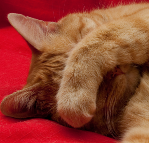
Here is a small block of pixels from a photograph, enlarged to 3200 percent. Doesn’t look like much, does it? It probably doesn’t immediately make you think, “camera-shy pussycat,” for example. Until we zoom out, making the pixels smaller, it just looks like a quirky job of kitchen tiling.
 We have to get far enough away (or “zoom out”) so that the individual tiles are barely distinguishable before the whole thing starts to make sense as an image.
Lesson 1, then, is “Pixels have to be small.” That means there have to be a lot of them. The shy kitty portrait on the left has 84,348, in fact, taking up what is probably about 3 inches square on your screen if you are reading this on a computer.
There are anywhere between 90 and 150 pixels to the inch on an average computer monitor, so the picture will look larger or smaller depending on your screen. But everything on your monitor, including text, is displayed at that 100 or so pixels per inch. That means everything on the screen is a little fuzzy.
“No!” you say, “My screen is pin sharp! It better be, considering how much it cost!” Well, let’s take a closer look. Here are two words from the title of this post:
![]()
Just because you don’t see the pixels doesn’t mean they’re not there. Let’s zoom in a bit, so we can see the fine detail. Now it’s obvious:
Nothing on a computer screen is dead sharp. You don’t notice this because it’s all that way, text and pictures. Those disposable “focus-free” cameras are like that: everything in a photo looks okay because nothing is dead sharp. Just don’t try to make an 8×10 enlargement.
That brings us to what happens when you put a picture on a printed page. On a printing press, text and images are also made up of dots, but text has more than two thousand of them to an inch. Individual letters appear very crisp, with razor-sharp outlines. If you put a picture with about 90 dots per inch next to some text at 2,800 dots per inch, the sharp text makes the picture look like mush. For a picture to look good in print, it has to start with at least 250 pixels per inch, preferably more, at the size it will appear on the page.
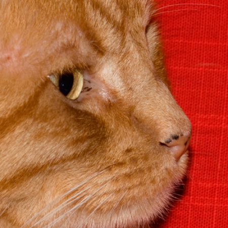
Our kitty picture won’t be three inches square on paper; it’ll be about one inch square. To get a good looking 3×3 print image of kitty, we’ll need to start with, not 84,000 pixels, but about 800,000. I don’t have any paper handy to show the effect, but here is an approximation that will give you the idea. First, an image with the correct resolution:

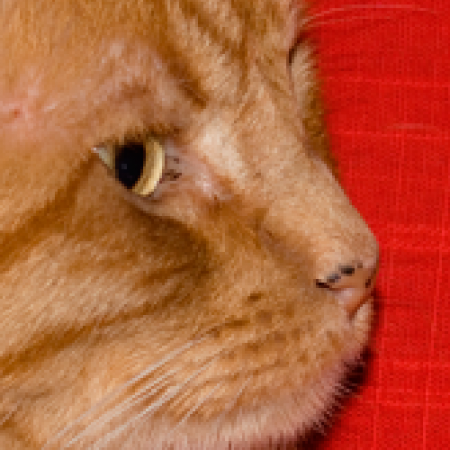
And now, the effect of trying to force too small an image to be the size we need:
So far, so good. I hope I’ve convinced you that a picture that looks good on screen isn’t necessarily going to look good at large sizes in print.
But there’s one more thing you need to know about images from the web, one that can make a picture look awful even when it is theoretically large enough: compression. I’ll cover that in the next post.
(Special thanks to our cat Mio, who graciously agreed to let me to use these images.)


