Ultra Essence is a national distributor of popular skin care products, sold primarily at shows, state fairs and similar venues, where people are looking for things they don’t normally find in stores. Their sales booth advertising was in need of a face lift, though, being just a bit too “down home” and not a good match for the quality of their main product, Ultra Balm. It’s a great example of how the design process works, and what it can do for sales.
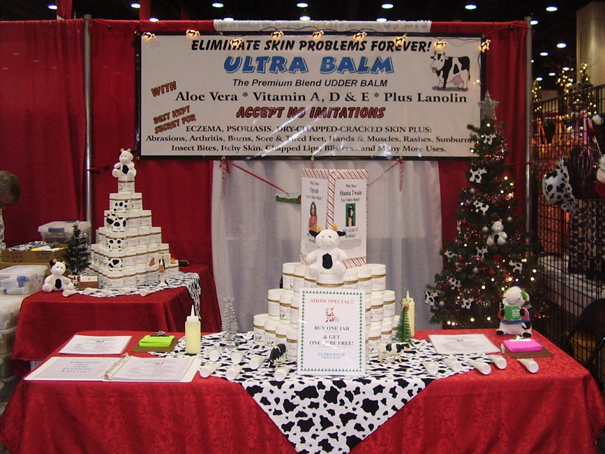
Here’s how things looked before. This is one of two different banners that were in use. Note the cartoon cow in the top right.

“The cow,” they said, “has to go!” I agreed. That wasn’t the only thing that “had to go.” The whole sign, with its mismatched fonts and gaudy colors, has a street-market vibe that isn’t in keeping with the product or its buyers. It also has no relationship to the product itself, apart from the name “Ultra Balm.”
A consistent look is essential in branding and marketing a product, no matter which market you’re in. The new banner would have to match the labels on the jars and tubes, so picking colors and fonts from the product label was the starting point for the redesign.
But… the company also didn’t want to look too “high end.” If you look too elegant, your typical state fair shopper will pass you by because they’ll assume your product must be beyond their budget. At the same time, too cheap and cheerful a look reduces credibility. Looks are everything. The answer had to lie somewhere between the two extremes: friendly enough to be approachable; good-looking enough to give a professional image. Understanding the context and the audience makes the difference between a success design and a poor investment.
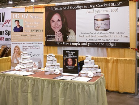
The starting point was the same font family and a color or two from the actual product label. The company also has a celebrity customer in just the right “over 30” age range to match their key demographic, who was happy to have her image on the banner as an endorsement. A friendly face is the perfect attention-grabber for the left end of the new banner (we read from left to right, so a dominant image on the right would lead the viewer’s eye right off the artwork) and a great starting point for the overall message.
The company was kind enough to send a photograph showing the banner in place, along with a note that they were very happy because they had experienced an immediate 30% increase in sales. That made me very happy, because I knew that we’d hit the mark just right.


Got a lot of insight! Thank you! 🙂
Totally agreed with what you said at the above banner having a street-market vibe.