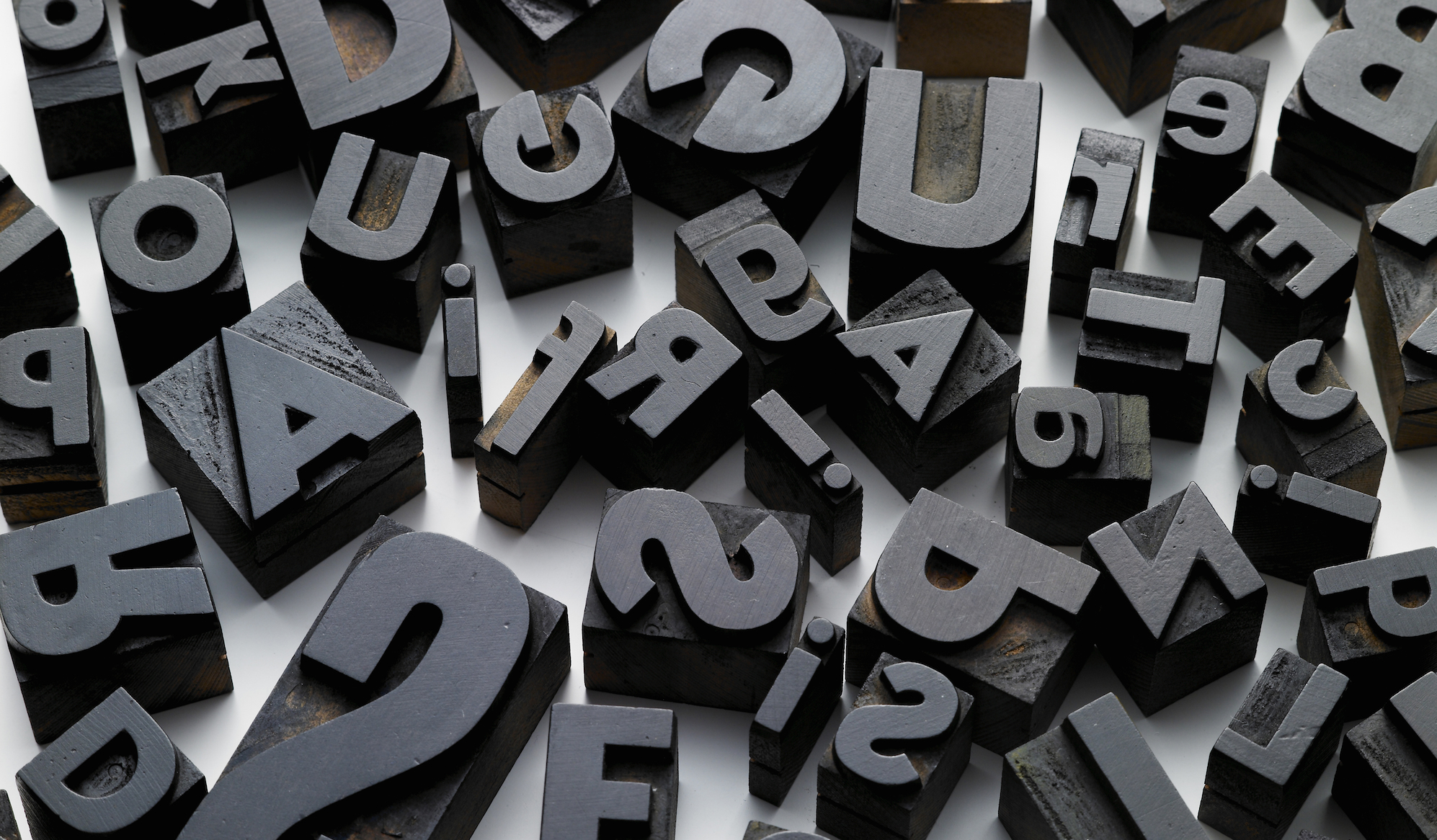
I’ve mentioned before that it’s important to choose your typefaces (not “fonts,” which are particular styles, like bold or italic, of a given typeface) carefully and not simply accept the defaults offered by Microsoft Word or PowerPoint. This goes for your business letters and for your advertising, packaging and signage.
A recent article on the American Institute of Graphic Arts (AIGA) “Eye on Design” blog describes an interesting study done among British and American visitors to London’s Victoria and Albert museum. The study was quite cleverly done, and looked at how type influences customer perception of how cheap or expensive something is. The article is well worth a read.
Choosing the right typeface for a project is something designers put a lot of thought into, because type is to writing what voice is to speech. If you own or manage a business of any kind, type is a subject you can’t afford to ignore. We often talk of type as having a voice. It’s a useful metaphor, because it expresses the many moods type can express:

Just about any mood you can express vocally, in fact, you can express with type. That’s important, because the typeface you choose for your company name, your business card, your letters or your website communicates its own message, independent of the actual words. The mood expressed by the font can complement the words, contrast with them or even conflict, sending entirely the wrong message!
Take a law firm, such as the famous (for listeners to Car Talk on NPR) law firm of Dewey, Cheatam and Howe. If they used Comic Sans on their nameplate…

…even the most type-oblivious person might think it a little odd, or perhaps wonder about the experience and reliability of the principals. An aggressively modern type, such as Eurostile, suggests a 21st Century firm, tech-savvy, possibly catering to Silicon Valley clients.
A corporate standard since the 1950s, the Helvetica family carries a definite association with large corporations and commercial work.
Setting the name in a 19th Century-style script face, such as Edwardian Script. sends a completely different message. You would suspect that the partners were probably approaching retirement.
Showcard Gothic, a decorative typeface, might be okay for a law firm specializing in the entertainment business, but even that would be quite a stretch. In an animated cartoon, the lawyers visited by the main character might well have a nameplate just like this.
When you put all that work into customer surveys, and you burn the midnight oil carefully crafting the perfect marketing message, also pay attention to the typeface you use. Choosing wrongly can send entirely the wrong signals to your audience. The path that you want the world to beat to your door has to have the right signage.


Valuable information here Alan. First impressions are very important and are actually a form of PR in themselves. I never really thought to apply it to this area. These impressions can be positive, or negative, as you so clearly communicated. Very interesting blog! Thanks.
I’ll never look at common signage the same…. thanks Greg
Thanks! I should have you review my typefaces. I also think you should come see me!
Great information, Alan! I love typography and with every job go through the things you mentioned in your article. It’s nice to have another viewpoint that I can resonate with and add to my options. Love your choices of web type, too…
Great ! Alan !! Great blog!!!