Trade shows are an important way for many businesses to reach their audience and generate interest in their products, but they have an equally important downside: they’re a very expensive investment. Unless you can coax jaded, footsore show attendees into your display, you can’t even get a conversation started. And that can mean your big investment just went up in smoke. For a graphic designer, that’s a challenge and an opportunity. In the case of Anna Elyse, the brand name under which fashion designer Annie Sokoloff markets her innovative line of bridesmaid dresses, it was also a chance to work with someone who is ferociously creative in her own right.
The Challenge
In creating a show booth, there are three things you have to accomplish:
The first is to stop the traffic. For the average trade show attendee, you have about a half second to grab attention before they look away and keep walking.
The second is to draw people in. It’s great that people stop to look at your booth, but that doesn’t help much if you don’t get to talk to them. They have to want to step into your display and find out more.
The third, once you’ve got them “in the door,” is to get your message across in a way that people “get it” without having to think too much. People at trade shows are bombarded with sales messages to the point where they quickly hit cognitive overload. If you want to be remembered, far less understood, your message had better be outstanding and simple.
I knew that if we could pull off those three things, Annie’s personal charisma and creative talent would do the rest. They are the principles that any kind of advertising must be based on. Some marketing texts have them as “Interrupt, Engage, Educate.” Sales trainers add an additional step, to give the famous A.I.D.A. sequence (“Attraction, Interest, Desire and Action”), but the principle is the same.
The first and third steps went together in the basic design of the booth; three large white panels on the back wall to provide plenty of visual impact, with a headline banner across the top. Putting them at the back would pull the eye and the attention (and, if we did it right, the people) into the booth.
The panels were to show the 3 steps of selecting a custom dress style from Annie’s signature “mix and match” collection of bodices and skirts. I knew I would have to keep them simple and quick to understand, and use the banner headline to inject a hint of mystery. “Reinventing the Bridesmaid Dress” was something we figured dress retailers ought to want to find out more about. Finally, we decided on a neutral grey background for the whole booth, to allow the panels and the colorful fabrics of the dress samples to stand out.
Because this was a major trade show in New York, at which all the heavy hitters display their new collections for retail buyers and the press, this was not a cheap undertaking. Getting a suitably distinctive and elegant look without breaking the budget was critical.
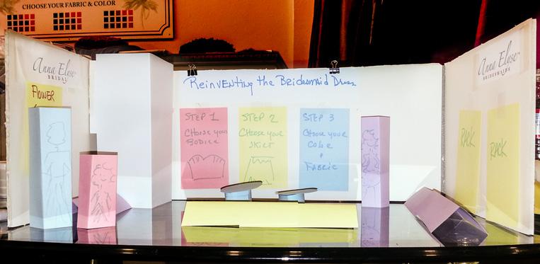
Here’s the mockup we created at the first meeting, on a tabletop using foam core, index cards and sticky notes. Very high tech, wouldn’t you say? (That rectangular bit in the back left corner is a 3 ft x 3 ft changing room for the model who would be showing off various dresses during the show.)

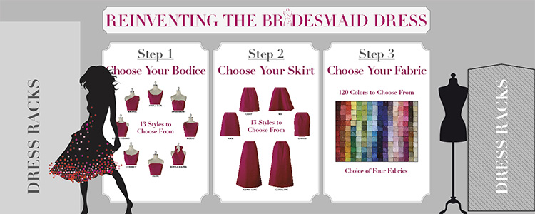
Armed with this smartphone snapshot, I created a formal, exact-scale design in Adobe Illustrator, similar to an architect’s elevations, so I could verify the exact sizes we would need for the various panels and banners and give the client a better idea of what it would all actually look like. Here’s how the back wall looks. (Note the changing booth at left, which was to have dress racks in front of it.) The individual panels and the banner were created separately, then dropped into the elevation.
We went over the kind of furniture that would be needed, both to provide a good place for potential customers to talk business and to leave the view of those back wall panels unobstructed, giving an open and inviting look to the presentation. With everything set and approved, I set the panels and banner printing in motion while Annie’s staff arranged for the furniture rental from a New York supplier. In order to make it simpler to get the display items to New York along with all the dress samples, what were to have been panels became vinyl banners, but the look was preserved.
The Result
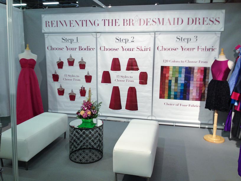
So what happened at the show? First, here’s a (somewhat shaky) snapshot of the actual booth when it was getting close to being finished:

The booth design achieved all its targets. Whereas in years past most attendees would walk by, oblivious, this time was very different. People stopped in their tracks, looked, got curious and walked in to look and inquire. Although this show was less well-attended than usual, the Anna Elyse booth had many more inquiries and generated strong interest with both press and potential customers. Retailers were excited by the simple presentation, that made it easy to understand the unique “mix and match” approach to creating individualized dresses, and the number of serious sales interviews was more than double previous years.
The Takeaway
You can’t get your message across to your potential customers if you don’t get their attention to start with; working out how you’ll do that is a basic part of any effective advertising. Whenever you begin to plan a new marketing campaign, it’s worth putting a large card on your wall with “1. Attract, 2. Interest, 3. Message” in big letters. It doesn’t matter whether you’re doing it in-house or working with an outside designer or agency, always keep in mind that you’ll not get to 3 unless you accomplish 1 and 2 first. This also applies to Internet, radio and TV advertising.


Excellent work Alan.
Thank you for this, Alan. The article itself, as well as its contents, exemplifies your point! Very interesting.
Well done. this is very interesting article! 🙂