Working with entertainment clients, you sometimes get a project that has to be turned out very quickly with limited resources. The show WILL go on, and a full-page ad that’s due on press tomorrow must have enough impact to make people notice the show and want to attend. On this occasion, we had about three hours to put something together. All that was available were two photographs of different sizes and styles: a live concert shot and a publicity shot, along with the date, time and venue information. The ad was to be a full page in a local entertainment weekly. The artist is Joe Bonamassa, the brilliant Blues guitarist, singer and songwriter.


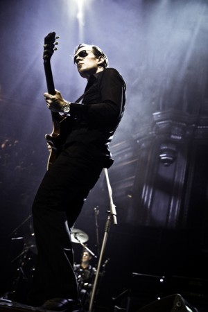
The performance shot is great, but it has a problem: he’s on the left of the photograph. If we put the ad copy on the right, he’ll be looking out of the page and the copy will be behind his back. If he’s on the left of the ad, the reader’s eye will stop at his picture before it’s reached the text, another reason to rearrange things. The image is a standard 2:3 format photograph, but the full ad is 10 inches by 12 (5:6 ratio), so we will have to either crop it or extend it.
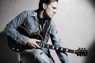
The other publicity shot the artist has provided is in horizontal (landscape) format. It is much too small to fill the page and visually not very exciting. It will work for editorial purposes, like an article in the local paper, or on a CD cover, but for a big ad promoting a high-energy, rockin’ show it won’t. The moody lighting and odd pose might work as a contrast to the action shot.
Although it wasn’t part of the information we were given, a little research on Google showed that this press shot was being used to promote Joe’s latest album, so it should be included in the ad.
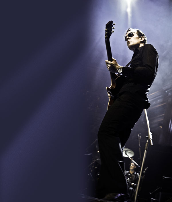
The first job was to create a background the size of the full ad, with Joe on the right so he has some space in front of him where an audience could be. By carefully picking a color from the photograph in Photoshop, and extending the rays of light from the stage lights, we end up with a nice open space for the ad copy that also looks like it is part of the original picture.

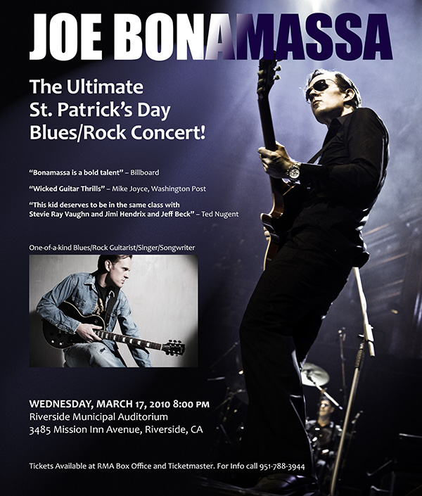
I wanted the artist’s name to be big, bold and at the top, leaving all that open space to add copy, the show details, and the publicity shot.
Notice that we’ve “lost” most of the right half of the photograph. Enough is left to provide some stage atmosphere, but now the artist himself provides a nicely shaped border for the copy space. By carefully placing the copy so its right edge parallels that shape, the whole piece comes together nicely.
The completed ad is below. (And in case you’re wondering, it was a great show and a packed house.)

P.S. If you’re interested in the technical details, ask a question on graphicdesign.stackexchange.com, where I tend to hang out, and I’ll be happy to answer.

Thank you Alan. That was terrific. I learned a lot.
Very nice solution! Thanks for sharing the link to this blog, Alan, I’m sure I’ll get lots of valuable advice from you by reading it. As always, you’re willingness to share is what makes you a star in the community.
Criminy! I’ll have to live up to that! Thanks for the kind words, Nicole.
Alan – good job on such short notice. It is very compelling!!
Thanks, Doug. Coming from you, I take that as a big compliment! 🙂
WOW, Allan, you are an ad master! I will definitely use this in making ads for our jewelry company, http://www.AccessorySnobs.com
Dean
I so enjoyed this blog. Your creativeness never ceases to amaze me! I love the finished product!
Thanks for the tip. This is awesome. I guess it goes with what does it take to become proficient. “I bet lots of hard work”
As usual you’re brilliant!
You’re too kind. As usual. 🙂