Client calls with a problem: a point of purchase display needs to be made ready for print production. The printer has some detailed requirements that the client doesn’t know how to ensure. Of course there’s a tight budget and they need the thing asap, if not sooner. The existing artwork is in a format (PowerPoint) that the printer can’t use.
This is not an unusual scenario. This being a long-standing client, I of course say “Not a problem. Send me the stuff and we’ll get it turned around quickly.”
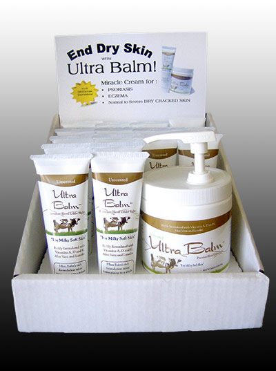
Here is the existing display:

The actual label had a number of problems: the photo of the jar and tube was a poor quality image that was not going to reproduce well no matter what: it was too small, and once an image has been “filtered” by a Microsoft application like Word, PowerPoint (in this case) or Publisher, it is in a peculiarly mangled condition that usually makes it unusable in professional layouts.
What to do? We always aim to give the client better than expected results. Turning the existing design into a printable piece wasn’t going to achieve that. I decided that a quick makeover was the best solution.
The picture had to go. Fortunately I had taken product shots of an slightly earlier version of the packaging and had them in the client archive. Creating an equivalent view of the jar and tube meant a trip through Photoshop to create it from separate images of each and make it look like they were casting shadows.
Now I had a high quality image to work with, I could turn to the rest of the label.
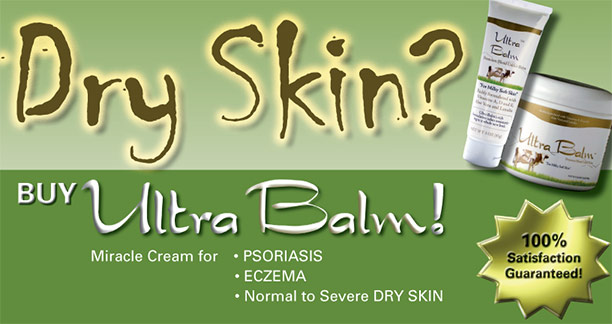
The biggest problem was that neither the typeface nor the colors (of the text or the “gold star”) had any connection with the product packaging. The white background was okay, but bland. I wanted a lot more zing, but there wasn’t time to do a major repackaging job.
A display of this type has to attract attention then hold onto it. Various studies suggest that a quarter- to half-second is all you can count on, so the headline has to be short and attention-grabbing. We eventually settled on “Dry Skin?” — a question that will instantly resonate with anyone who has that problem.
Another quick trip to Photoshop produced a more attractive “gold star.” Background colors taken directly from the product label allow us to create a “two panel” layout, and using a grunge typeface for the headline adds to the “dry” message. Here’s the final result:

The total design time, including Photoshop work and a quick web conference with the client, was short enough to meet the deadline and stay inside the client’s budget, but we still managed a major upgrade in the look of the counter display.
With a little more time and a better printing budget, I would have recommended a die-cut display card, with the top of the tube sticking up from the rest. This would add a more professional “zing” to the display. Perhaps next time…
