Design Always Has a Message

A couple of recent articles on John McWade’s Before&After blog really point up the importance of keeping the audience in mind, as opposed to the designer or the client, and designing for that audience.

A week or so ago, John posted two Craig’s List ads for the same classic Jeep. He asked for comments as to which one his readers felt more likely to sell the car. You can read that post here, along with the many, many comments. Look them over, read the responses, and make up your own mind.

Continue reading

Looking good in print isn’t just about “art”

Ann Wayman, whose excellent blog is a terrific resource for freelance writers in any field, left a comment the other day about an author whose book had been “designed” by someone with super-powerful design software, but who clearly had never bothered to learn the hows and whys of graphic design. It wouldn’t, Ann conjectured, sell very well. She was exactly right.

Continue reading

Why We Design

John McWade is a designer’s designer, someone who not only does superb work himself, but has been a teacher and inspiration to many, many others in the years since he became the very first user of the very first desktop publishing software: Pagemaker. I frequently recommend his books, “Before and After: Graphics for Business” and “Before and After: Page Design,” to clients and anyone starting out in the design field. He is also the publisher of Before and After Magazine, one of the finest, certainly the most practical periodical in the field.

This recent post on his blog not only sums up why designers do what we do, but puts our work in a different and thoughtful light; one that it is much too easily missed in our well-fed, computer-aided world.

A Typographic Take on Human Rights

Here’s a brilliant animation that presents the Universal Declaration of Human Rights in various flavors of Helvetica. Considering how clinically “clean” Helvetica is — the most beautiful or the most boring typface in the world, depending on whose opinion you ask — the amount of emotion and poignancy that Seth Brau imbues it with is amazing.

Two big thumbs up, as they say in the movie biz.

Typefaces and Fonts — Your Opinion Counts!

Thomas Phinney, the noted type designer who designed at Adobe for many years, is conducting an informal survey of people who use type (fonts, typefaces) on their computers. He’s interested in how people use the terminology of type, and although some of the questions are undeniably of interest mainly design geeks he also wants input from more casual type users, such as people who use only the standard office type programs such as Microsoft Word, Open Office, and the like.

The survey is here, hosted on the surveymonkey.com website.

Go ahead and take the survey! Your opinion counts, too!

Down to a Tee

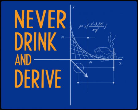
I came across an odd but fun website that does nothing but sell t-shirts. It’s not the only such site out there, by a long way, but the designs have a quirky sense of humor that’s refreshingly geeky and stays on the right side of good sensibility (for the most part, anyway). I have to admit it appeals to my own quirky, admittedly geeky sense of humor.

Here’s an example:

Don't Drink and Derive

Another design shows a cow talking to a milk bottle (remember those?) and saying: “Milk, I am you father.” To which the bottle, of course, replies “Nooooo!”

The company is SnorgTees. It’s good for at least a grin any time you feel the need of one.

Gridiron Flow beta goes public

I’ve been working with the Gridiron Software folks for a while, beta testing a radical new product that promises to quietly (or not so quietly) revolutionize the way folks like me track our many design projects and the hundreds of files associated with them. In a nutshell, Flow watches while you work, and automatically notes what photographs, design files and other digital assets are used in the projects you work on. It keeps track of where they are, what other projects they are also used in, and how long you worked on them. Continue reading

Point-of-Purchase Display Quick Fix

Client calls with a problem: a point of purchase display needs to be made ready for print production. The printer has some detailed requirements that the client doesn’t know how to ensure. Of course there’s a tight budget and they need the thing asap, if not sooner. The existing artwork is in a format (PowerPoint) that the printer can’t use.

This is not an unusual scenario. This being a long-standing client, I of course say “Not a problem. Send me the stuff and we’ll get it turned around quickly.”

Continue reading