
For a typical author, it’s all about the content. That’s as it should be. Creating a book of any kind, whether it’s a novel, a how-to, or a travel book, takes a tremendous amount of creativity, thought and hard work. The last thing an author wants to think about, usually, is the mechanics of production or how the finished product will look. It’s all there in deathless prose, in that big Microsoft Word or Apple Pages file. The work is done. What else could there be?
But no matter how well-crafted the content is, it doesn’t come alive until people, preferably lots of people, read it and recommend it to their friends, who also buy it and read it and recommend it. Word of mouth is everything; don’t let anyone tell you different.
Getting that process started takes marketing, plus another ingredient that is sometimes completely missed: for a book to sell, it first has to look like a book that’s worth the price. An ugly or amateur-looking cover can turn off a potential buyer. That’s especially true if they’re on Amazon and there’s a better-looking, professionally done cover sitting right below yours on the page, on the same or a similar subject.
Here’s a book I’ve visited before. Which of these would you be more likely to buy?
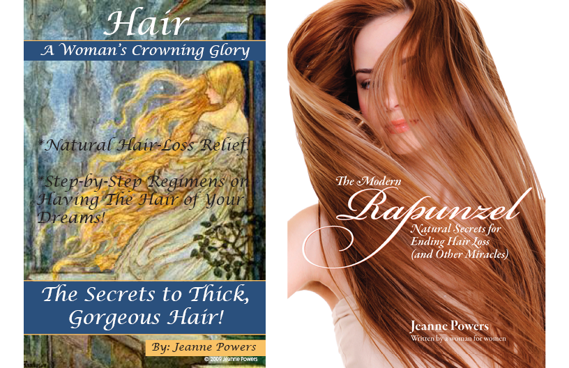
People do judge a book by its cover, despite the old saying, so don’t discount the importance of getting something done professionally by a good illustrator or designer.
What the inside looks like is important, too
Even when your book passes the cover test, barriers to the sale aren’t over. The page design, the text layout and the table of contents design must invite the reader onto the page and into the story.
When they’re browsing in a bookstore or online, most people read a few pages here and there to get a sense of how well the book is written and how easy it will be to read. Ugly pages or horrible typesetting will stop a potential sale in its tracks; who wants to look at ugliness for hours on end? But even “so-so” design can have the same effect, simply by not looking inviting. A well-designed book will invite you to read, or will even make you want to read.
There’s a paradox here: the reader doesn’t notice the type when it is done well, only when it is done badly. (The expression “Nobody notices a clean window” applies perfectly here. Typography, the art of designing and setting type, is the only art that aims not to be seen.) Good typography connects the reader to the author, and otherwise gets out of the way.
The fonts, line spacing and margins make a big difference. A poorly chosen font becomes harder and harder to read as you go on. A font that works well on a printed page may not work well on a mobile device screen, such as an iPad or Kindle, and vice versa. If the reader starts getting eyestrain within the first two chapters, discomfort alone will stop her reading. That is another way a reader can “notice” the type, without recognizing the source of the problem. That person’s friends won’t get her recommendation, so they’ll never buy the book in the first place.
Where will you publish?
Good question! There are many ways to get your book produced. Author Ben Coles has written an excellent survey of the two biggest resources for self-publishing authors: Kindle Direct Publishing and Ingram Spark, and for high-end (expensive) works like photo books there’s Blurb. In all of these cases you need to be aware of the service’s specifications, which must be exactly followed to ensure a good result, and what slice of the selling price they will take.
Some local print shops provide “Print On Demand” (POD) service. They will normally require a certain minimum order quantity to cover their setup costs, but you have the advantage that you can work directly with the printer to ensure the printed product comes out looking its best.
So if you’re looking to self-publish your book, as an increasing number of authors are, give thought to how it will look in a side-by-side comparison with its professionally-designed competition. It really does make a difference.
Just loved all of this!