
Microsoft Office is everywhere. There’s hardly a company, from enterprise to small business, that doesn’t use it to create letters, proposals, estimates, promotional emails, even flyers and (gasp!) ads for the Yellow Pages. The “desktop publishing revolution” was supposed to put great-looking documents within reach of Everyman and change the world, feed the poor, end war and usher in a golden age of rainbows and unicorns.
Why, then, did these great-looking documents not happen? Why do we flinch, ever so slightly, whenever we see something obviously produced on the kitchen table? What is it that makes something look like it was produced on the kitchen table (besides the ketchup stains)?
Technology is a wonderful thing, but it doesn’t substitute for the human eye, and there’s also this annoying fact: it takes time to learn how to use it. In the interest of creating a more aesthetic environment for everyone, I’m going to explore, in these next few articles, things you can do to make your letters, proposals and, yes, even your quick promotional flyers better looking and, more important, more inviting to the reader.
Let’s start with something really basic.
Defaults Are Not Necessarily Good For Your Image
Almost no-one moves beyond Word’s default settings. We see endless swaths of Times New Roman to the point that many people are really, really tired of it. That’s one of the the first clues to kitchen-table design. Times New Roman screams: “I’m using Microsoft Word or Publisher, but I’m not sure what to do with it.” Newer versions of Word default to Calibri, a clean, modern (for the moment) font which will eventually become a cliché, too. Perhaps by then Times New Roman will again be usable for business communications, but that time is not yet.
The original Times font was created for (surprise!) The Times newspaper of London, England. It is designed to read well in narrow columns of text, so the letters themselves are narrow. This heritage lends a certain dignity to the entire tribe of Times typefaces, and it’s still used by many newspapers. But a business document is almost NEVER in narrow columns, quite the reverse, in fact, so Times is left fighting its own design, and is actually less comfortable to read than many alternatives. As Matthew Butterick, author of the influential Typography for Lawyers says:
“When Times New Roman appears in a book, document, or advertisement, it connotes apathy. It says, “I submitted to the font of least resistance.” Times New Roman is not a font choice so much as the absence of a font choice, like the blackness of deep space is not a color. To look at Times New Roman is to gaze into the void.”
Your computer has a number of fine-looking typefaces (designers call them that, because the term “font” means something more specific: Arial Bold and Arial Italic are two different fonts in the same typeface, and in the old days of metal type, each size was its own font). Palatino, Bookman Oldstyle and Cambria are all very readable typefaces that are almost universal. If you have Word, you have these typefaces.
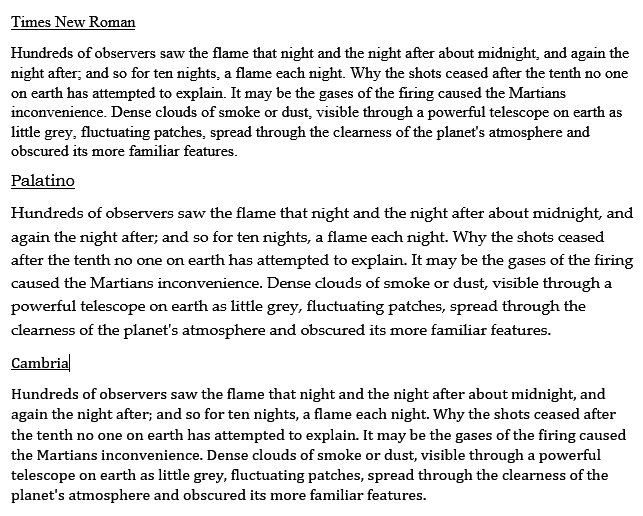
Notice the difference? The wider character shapes are easier on the eye, especially in longer lines of text. Your readers may not know why, but they will find your text more inviting, and more comfortable to read.
So here’s the first tip: To make your document look more professional, click on that drop-down arrow beside
“Times New Roman” in the toolbar, and pick a more readable typeface. Your presentation will immediately move up a notch, and all your communications will look and feel that much more professional.
Oh, and a BONUS TIP for these economy-minded times: Arial and similar typefaces (like the one you’re reading now) use almost twice as much toner or ink as the ones illustrated above, because the lines that make up the characters are the same thickness. A typeface that has thick and thin lines is more readable and saves you money on your office printing. You’ll get almost twice as many documents per cartridge, in fact.
Next time: Spacing and Indents. Some easy ways to make your documents easier to create, easier to edit, and much more attractive.
Alan, It seems as you changed the template of your blog, because the *supposed* different fonts in the text are all the same. Perhaps it would be best to use images instead.
Overall, good text. In other words, you have spoken my mind. (I am not a typographer or designer, BTW)
Thanks for catching that, Paulo! There was an image that somehow went missing in switching from one host to another. Now replaced.