I’ve mentioned Ultra Essence before. They were the subject of an earlier post because they provided a great example of how a correctly designed advertising display increases sales. The company has a new skin-care product for men, “Ultra Handy Man” or simply “Handy Man,” that gives me the chance to write about a simple case of creating a logo and a brand identity, and nicely illustrates the difference. The rest of their products primarily target women, so this is a departure from the usual line of business. Handy Man is for people who work with their hands: construction workers, carpenters, truckers. The logo and branding their label provider had come up with didn’t meet with management approval, and the job was passed to me.
Here’s what had been proposed:
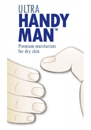 The major problem with this design is that it looks smooth and clinical, like Band Aids or surgical gloves, not like something for a construction worker or a trucker to use on the job. There’s just nothing masculine about it. The hands in this illustration aren’t working hands. (Next time you see a bricklayer with perfectly manicured nails like these, let me know. I’d like to meet him. Or her.)
It’s also dull. It wouldn’t attract attention or interest. A brand identity must be memorable, and this just isn’t.
Advertising grooves in a brand or a campaign “look” by repeating the same visual message over and over again in different contexts to build recognition, whether on the product itself or in advertisements. But the message must be interesting to start with, otherwise the campaign will be grooving in boredom instead of recognition.
The first thing we need is a logo. (In this case, the “wordmark” — the correct term for the name of the product or company set in a special way that identifies them. The familiar Coca-Cola script is a wordmark)
The lettering for this product name must be at home in the world of industry, construction, trucking, do-it-yourself and similar activities that are hard on the skin. We need industrial strength lettering.
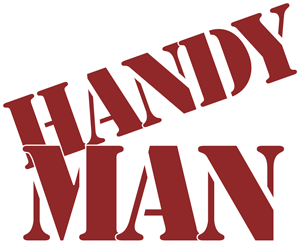
What could be more industrial than those stenciled labels you’d see on a big wooden crate? There’s a font for that, too. It’s called, appropriately enough, “Stencil,” and it works well for the words “Handy Man.” By setting the word “HANDY” at an angle to match the diagonal stroke of the M in “MAN” we get some tension and a sense of action. We give “MAN” a subtle emphasis without being crass by making it larger, which also allows it to balance the width of “HANDY.” The letters are overlapped slightly to keep the whole compact, and a white border adds a little dimension at the same time as it keeps the letter forms clearly visible.
With that done, the next task is to put it in context. Although the immediate job is to create the label for a 4 ounce tube of the product, there will be other items such as jars, point-of-purchase display packaging, sell sheets, counter displays, web ads, TV ads and possibly banners. It isn’t enough, then, simply to whip out a quick label design.
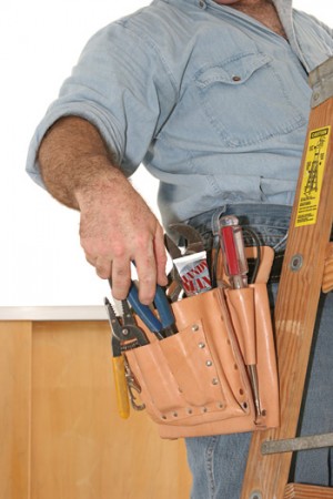 Putting a new product on the market demands a brand image repeated across different media, all carrying the same message. The usual approach is to map out a campaign, plan one or a series of photographs that will appear in the advertising, then hire a photographer.
There was no budget for photography in this case, but we lucked out with a stock image by photographer Lisa F. Young of fotolia.com that fit the requirements exactly: big enough to crop for different contexts, and with exactly the right message.
A photograph of a similar product tube, a little Photoshop magic, and suddenly we have a “tube” of the as-yet-nonexistent product in the electrician’s tool pouch. We have a brand image.
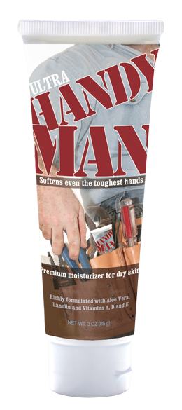 Producing the label requires adding the surveyed catch-phrases or buttons for the buying public, ingredients on the back, etc..
For the company’s overall brand word, “Ultra,” the script lettering used on their other products would look out of place. Rather than repeat the stencil type, which would be hard to read at small sizes, we use Clarendon, very readable at small sizes and different enough from Stencil that it won’t clash.
The conceit of having the tube label pictured on the tube label itself is not obtrusive, but it’s there. It encourages a double take without being gimmicky.
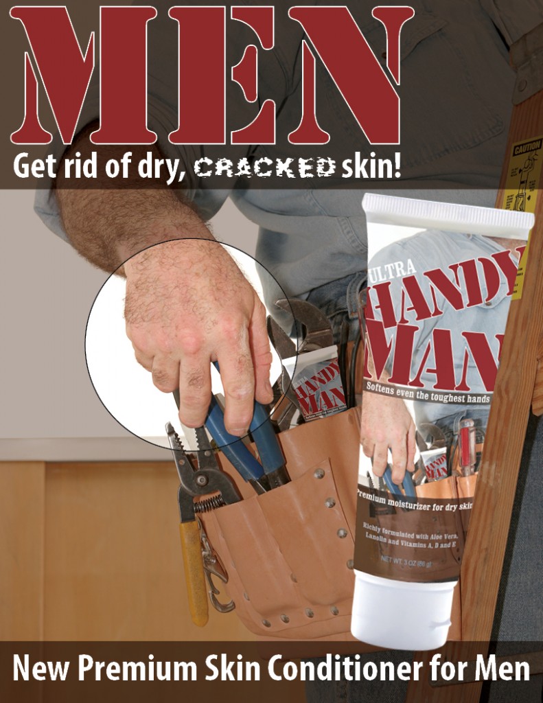
Finally, here is an example of a counter display that continues the branding using a differently cropped version of the image and the same typeface and type color as the product name. Darkening the background image lets us “punch a hole” in it to focus attention on the hand. It adds depth by making the large image of the tube appear to be closer to the viewer. Overlapping the bottom panel with the tube cap enhances the three-dimensional effect.

