
There are some things you should never do when typing documents in Microsoft Word, Apple Pages or any other word processing app. Some of these avoidables may be deeply-ingrained habits. Some may invoke a cry of, “But I’ve always done it that way and nobody ever complained!” All of them will lead you down a slippery slope, into bad typographic neighborhoods from which few return unscarred. Best to just say “No” in the first place.
Here is one that’s not hard to fix, and will make your business letters look just that much more professional than your competitor’s (who, it must be pointed out, doesn’t read this blog).
The Space Bar: Between Words, Only
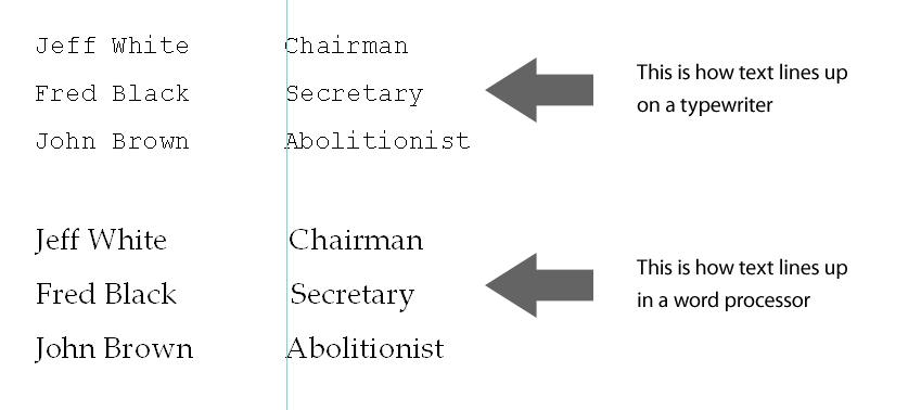
If there’s one thing that will surely make a document look ugly, it’s trying to line things up from one line to the next using spaces.
On a typewriter (machine for typing out documents without a computer, sort of like a printer with its own keyboard — your mom can explain), all the letters, figures and punctuation occupy the same fixed width, so it’s easy to line things up vertically by just hitting the space bar a few times. That’s still true if you use a fixed-space font like Courier, although it’s still not a good idea for another reason I’ll cover later.
When you use a “proportional spaced” font, which is almost all of them, the spacing is not fixed. Not only do different letters, figures and punctuation marks have different widths, spaces are not all the same width. Worse, two lines of text might look like they line up on the screen, but your printer doesn’t necessarily interpret letter spacing the same way your word processor does, so the printed version may be a mess.
Even on screen, you can usually see the difference. I’ve added a vertical line in this illustration to make the point obvious:
The same goes for indenting the first line of a paragraph: if you use spaces, those indents won’t be exactly the same from one paragraph to the next. Your document will look subtly “wrong,” even though most people won’t be able to say exactly why.
The solution to this is the Tab key.
“Tab” is short for “Tabulator” (“that which arranges things in tables”). On a typewriter or a teletype machine (think “instant messaging without a screen”), when you wanted to type out tabular information such as a balance sheet, you set little metal stops where you wanted things to line up.
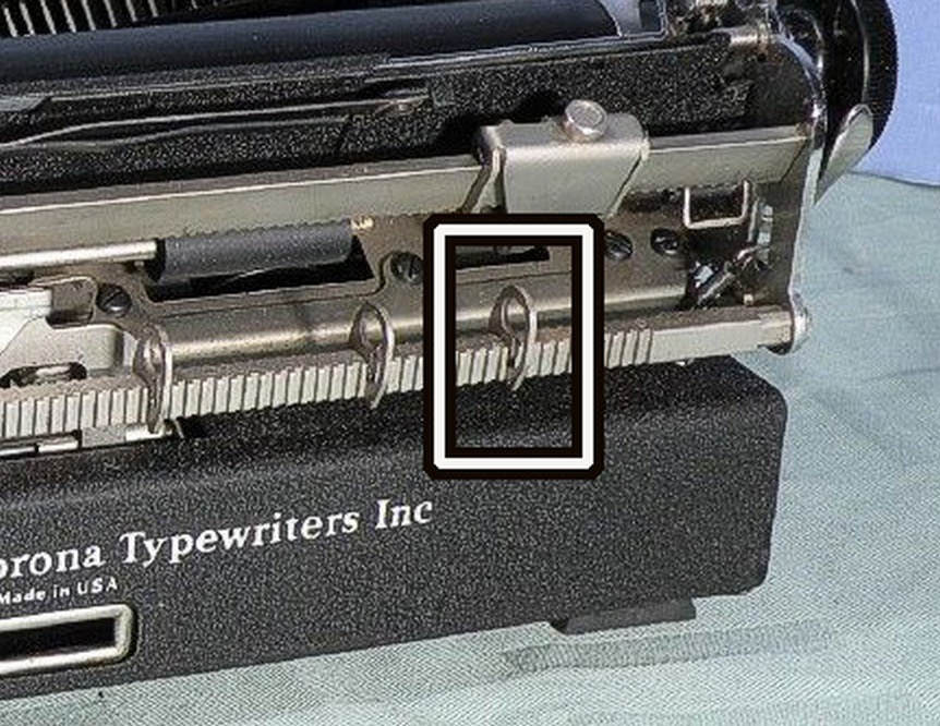
Pushing the “Tabulator” or “Tab” key sent the carriage rocketing to the next stop.
Computers inherited the old typewriter keyboard layout, and Tab came along for the ride. By default, your word processor puts an automatic tab stop every half inch. Notice that’s “every half inch,” not “every five characters.” A tab stop will put your text at an exact place on the line, and, just like on a typewriter, you can set tabs anywhere you want.
Lets look at our example again, using a tab instead of spaces:
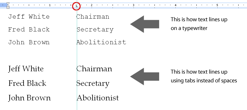
Everything lines up perfectly, just as it should.
Notice the small L-shaped mark in the ruler bar above the text (circled in red). That’s a tab indicator, showing exactly where the tab stop is in the paragraph.
To get the ruler bar visible in Word, choose Ruler from the View menu, or use the Help function in your program to find out how to display them. Click on the ruler to set a tab, drag the tab mark to position it where you want, or drag it off the bar to remove it.
An extra benefit of using custom tab stops is that if, say, Jeff White resigned and was replaced by Joseph Greene, the longer name won’t push the word “Chairman” to the right; the tab stop ensures it will stay exactly where you placed it.
Centering Headlines
Of course, you would never center a headline using spaces, but a lot of people do exactly that. No, really, it’s quite common.
There are two problems with this. In the first place, it’s unlikely that the centering will be accurate. More to the point, if the wording of that headline changes, or if the page margins change, it won’t be centered anymore: spaces must be added or removed, which just adds unnecessary work.
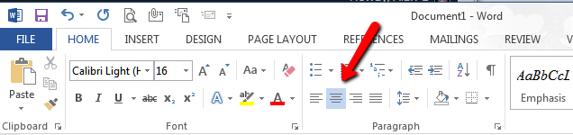
In Microsoft Word, there are two common ways to center any headline or paragraph. One is to click on the icon that looks like a tiny bit of centered text:
 The quicker way, which doesn’t require you to take your hands off the keyboard, is to press Control+E (Apple+E on the Mac), for cEnter. (Control+C was already taken for “Copy,” in case you’re wondering.)
thanks, informative, simple and to the point the derivation of the Tab key was and interesting bit of information that I didn’t know. Typewriters.. Oh yea I remember what they were.
I like to say “never type the same character repeatedly unless you’re typing balloon.” It’s a joke, of course, but in general, don’t type two spaces or two Returns, or two hyphens next to each other or multiple tabs in a row…
Indeed. Of course, I have a vested interest in all this. It all cuts down the amount of work I have to do to turn a manuscript into a press-ready book!
Useful data, effectively presented in a simple, easy to follow format. Thank you Alan!
Interesting. That was exactly I was doing……
Very informative article, Alan. Thanks for sharing it with me.