By now, if you read the last post, you’re starting to think that designers seems to place as much importance on the spaces around and between things as on the things themselves. And you’re right.
One of the great concert pianists of the 20th Century once remarked that what defines a great performer is not the notes he or she plays, but the spaces between them. The same could be said about text, which includes everything from novels to business letters to the way you lay out your resumé. Good spacing can make a document look more attractive and inviting to read. Bad spacing can make your reader feel uncomfortable or annoyed, or even make them skip the whole thing.
We looked last time at the margins around your text, and I hope we have now banished cramped pages and stingy-looking margins forever. Now let’s turn to another important bit of space: the one between the lines.
Why is that important? It has to do with how your eyes move when you are reading a piece of text.
Before we begin, there’s one term I want to clear up for those who may not know it: Point. A point is a centuries-old measurement related to type, equal to about 1/72nd of an inch. 12 points (the usual default size of text in a word processor) are 1/6th of an inch. In the days of metal type, the point size of a font was the height of the metal block that each letter was engraved on, which allowed a little empty space above and below the actual letter.
Do My Eyes Deceive Me?
Have you ever had the experience when reading something that you accidentally started reading the same line over again, or the text suddenly made no sense until you realized you had inadvertently skipped a line? I’d guess that the answer is “Yes.” I’ll take another guess that you didn’t enjoy the experience and that you felt a bit annoyed.
Why did that happen? Your eyes have to make a jump to the left and down to catch the beginning of the next line. If that line is too close to (or too far from) the one before, your eyes jump too far, or not quite enough, and you end up reading the wrong line. Exasperating, no? Well, you don’t want to do that to your readers, so let’s look at the solution.
Spacing Those Lines
You have already shortened the length of your text lines by giving generous left and right margins. That’s good, because your reader’s eyeballs don’t have to leap a yard to the left to find the next line. Even so, if you’re working with Word’s or Open Office’s default line spacing, you’re probably still a bit cramped.
Here is an example using Calibri, the default type in recent versions of Microsoft Office:
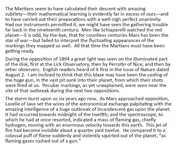 It’s not terribly comfortable, is it? Also it’s obvious that the paragraphs look crowded and a bit intimidating. Even at a glance you can tell it’s not going to be so easy to read.
The Word default is “Single” spacing, a term that comes from the days of typewriters. If you swung the carriage back (or pressed “Return” on an electric typewriter) one time, you got single spacing. For “Double” spacing you did it twice. Really fancy typewriters had a special setting for “One and a half” spacing. Word processors provide all of these, but they’re a pretty crude approach to spacing. Typewriters are not what people write their correspondence on anymore, but their legacy endures.
Buried in the paragraph format settings in Word and Open Office (search for “Line spacing” in the Help menu of whichever version you are using to find this), is a setting that allows you to specify the exact amount of line spacing in points. In this case, let’s change the line spacing for our 12-point text to 16 points:
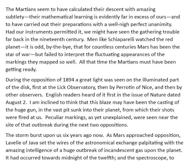 This text is much more comfortable to read; it’s no longer such a dense, intimidating crush of words. Someone might actually feel inclined to read it!
Typographers refer to the spacing between lines as “leading” (pronounced as in “lead pipe cinch”). The term comes from the days of metal type, when strips of lead were inserted between lines of text to give it the spacing that was needed. Type with no extra lead strip was “set solid.” That is what “Single” line spacing is. In our example we added “four extra points” of leading.
If, in reading this, you thought “Hey, what about if I just shortened the lines?” then go to the top of the class. Narrow columns of text need less leading, because the eye doesn’t have to travel as far. This works in newspapers, for example, but not in a typical document that has only a single column of text down the page.
You can train your eye to recognize good and bad spacing. Next time you read a book or a magazine, notice text that is inviting and comfortable to read. Compare it to text that makes you flinch a bit before you start reading. Observe how margins and line spacing affect how easily (or not) you read the text. After a while, you’ll really start to notice it, and your presentation in print will look better and better.
Thanks Alan for your great tips
What about shorter galleys. I am always trying to make short galleys as in newspapers as the eye travels down the page so much faster.
You mean, as in the second-to-last paragraph? 🙂 You’re absolutely right, of course, up to a point. It is also possible to make the lines too short!
Rather than “galley,” I use “column of text” and “width of the line” to avoid confusion. (“Say, Myrtle, what do short ships have to do with typing? How does a ship go down a page? Zzzzzz.”) Even in printing and publishing, there’s more than one definition of galley. The one you’re using, the frame that a single column of metal type was set in, is hard to find. Sadly, many readers won’t bother. They just go blank and move on.