This is the story of a book. It starts in a waiting room, where the lady sitting next to me had a spiral bound book on her knee. It looked — it screamed — “home made.” It wasn’t something you’d want to try to read. I couldn’t let it go by without doing something to help, if I could.
Here’s what the cover looked like:
In the last post I talked about pictures that are too small to be useful in print, and this is a great example. The blurry, blobby look of it in this image is actually better than how it looked on paper at 5 inches wide by 8 inches tall.
A brief tour of what else is wrong: The typeface, Lucida Calligraphy, would look great on a certificate but looks quite out of place on this busy background. Some text is centered, some isn’t. It disappears into the background. The blue and yellow bands are an attempt to solve that problem, but between the blue bands the text is almost unreadable. The bullet points (on a book cover!) use an asterisk instead of a real bullet character. Because most of the words are the same size, or nearly so, it’s impossible to tell what is meant to be the title of the book.
“Your book?” I asked. “Might I make a suggestion? I’m a designer, perhaps I can help.”
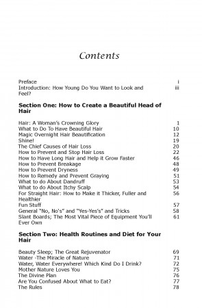
As we talked, I got a look at the inside of the book. The table of contents looked like this:
That heavy black type might work for a thesis, or a government report, but it’s wrong for a book about how to have beautiful hair. In fact, it’s a font called Verdana, designed for websites rather than print. It also makes the calligraphy-style headline look completely out of place.
Then there are those orphaned single words where a line was slightly too long for the width of the page.
The book text is in the same type style, with tiny margins and tightly-packed lines so that the pages look black and intimidating. The whole impression is about as unfeminine as you could get, and entirely wrong for this book. Jeanne, the author, knew that, but she didn’t know how to solve it until that chance conversation with a friendly designer gave her the solution. Not long afterward, she asked me if I’d take on the project of redesigning the book.
Book design is a bit of a paradox. Good typography invites the reader to the page, but then it gets out of the way. The reader should never be aware of the design, or the font; only the content. A book must look good, but above all must be easy to read. The last thing you want is for the type or the layout to get in the way of what the author has to say and the reader wants to understand. The cover should be noticeable, attractive and appropriate, so that someone will want to at least pick up the book and browse the contents. When they do, that content should invite reading.
After that, it’s up to the author to have something interesting to say and to say it well. In this case, that part wasn’t going to be a problem, because the book is well researched and the style is engaging and informative.
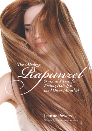
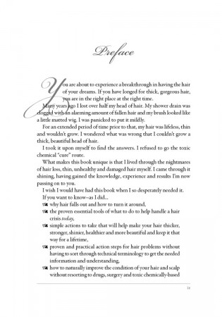
 The book needed a larger format, so that the margins could be enlarged to give the text room to breathe. A combination of an elegant script font, Adobe’s Bickham Script, and a classic text face, Garamond, make for pages that are clean and easy to read. The same typefaces on the cover, with an image that really says what the book is about (and is large enough to look good), make the finished product great to look at and easy to read.
When it went on sale on Amazon, it was the fulfillment of a dream for the author, and it is selling well, in part because it looks like what it is: a well-done book with good, reliable information about women’s hair health.


That’s a beautifully typeset page! Do you use InDesign? I’d love for you to contact me about your prices for typesetting a book.
Thanks for the kind words! Yes, I’m a long-term InDesign user (and occasional instructor), often found dispensing assorted InDesign (and Photoshop) design advice on graphicdesign.stackexchange.com.